how it is today
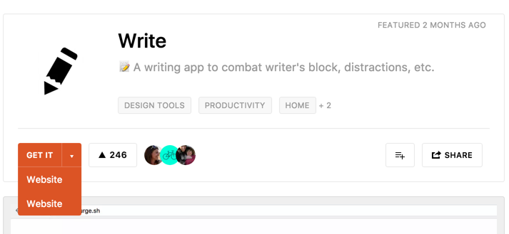
After getting to know what the Maker has to say and the discussion around the product, if you want to download the app or access the website, you have to click on the orange “Get it” button. Sometimes, it’s a drop down with multiple links, just like the example below.

At first, I thought there was a programming error which would cause the duplication of the links. I was mistaken. What happens here is that one link sends you to the service’s website and the other one to the Github page. The problem is that the Product Hunt’s page doesn’t identify what is what, nor by the link label or the URL displayed when hovering the link, having the user, like myself, to click twice in order to find out which is the correct one for me - in this case, only the product’s website.
recommendation
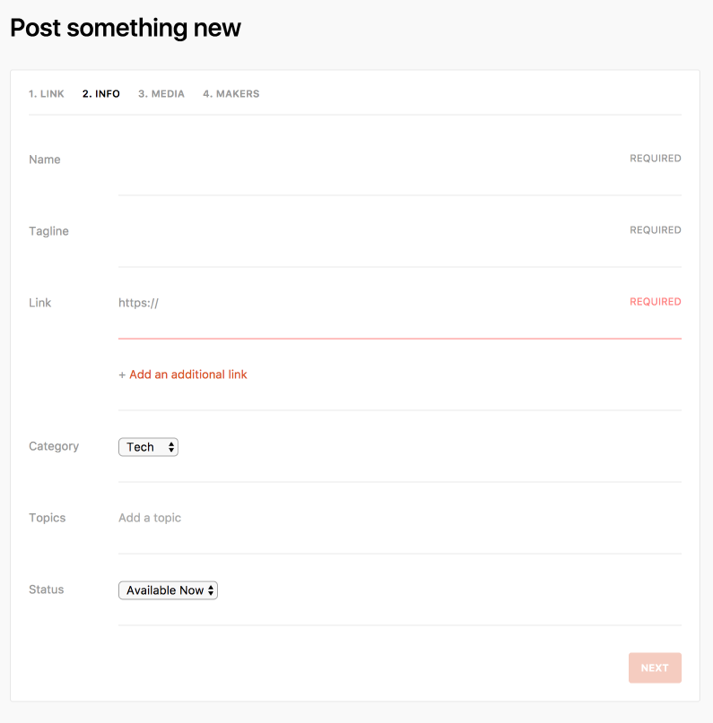
To add a product to Product Hunt, the user needs to fill up some information. For the second step of it specifically, shown in the example below, the user indicates one or multiple URLs, so the community is able to access the final product’s page or other additional links.

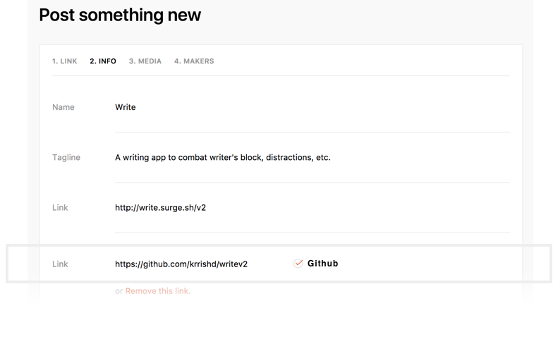
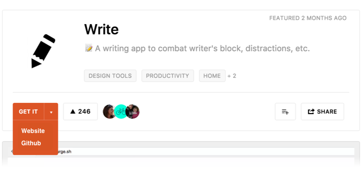
A simple and seamless solution would be for Product Hunt’s website to identify the URL and automatically display it as the label for the “Get it” links.
Using the Writer example above, the additional Github’s link would look like this when posting the product on Product Hunt:

As a result, the URL has an automatically identified label, making it easier for users to know what they are getting/accessing, and the drop down button on the product’s page would look like this:

Update: on August 28th, Product Hunt introduced some new improvements regarding UX and that included a new way of accessing the product's content, which is exactly what this article was about. Well done, PH!
Thank you for reading. You are very welcome to share with me any thoughts you have. That's it for today.
| end of day 1 | ||
| back to all | next |