how it is today
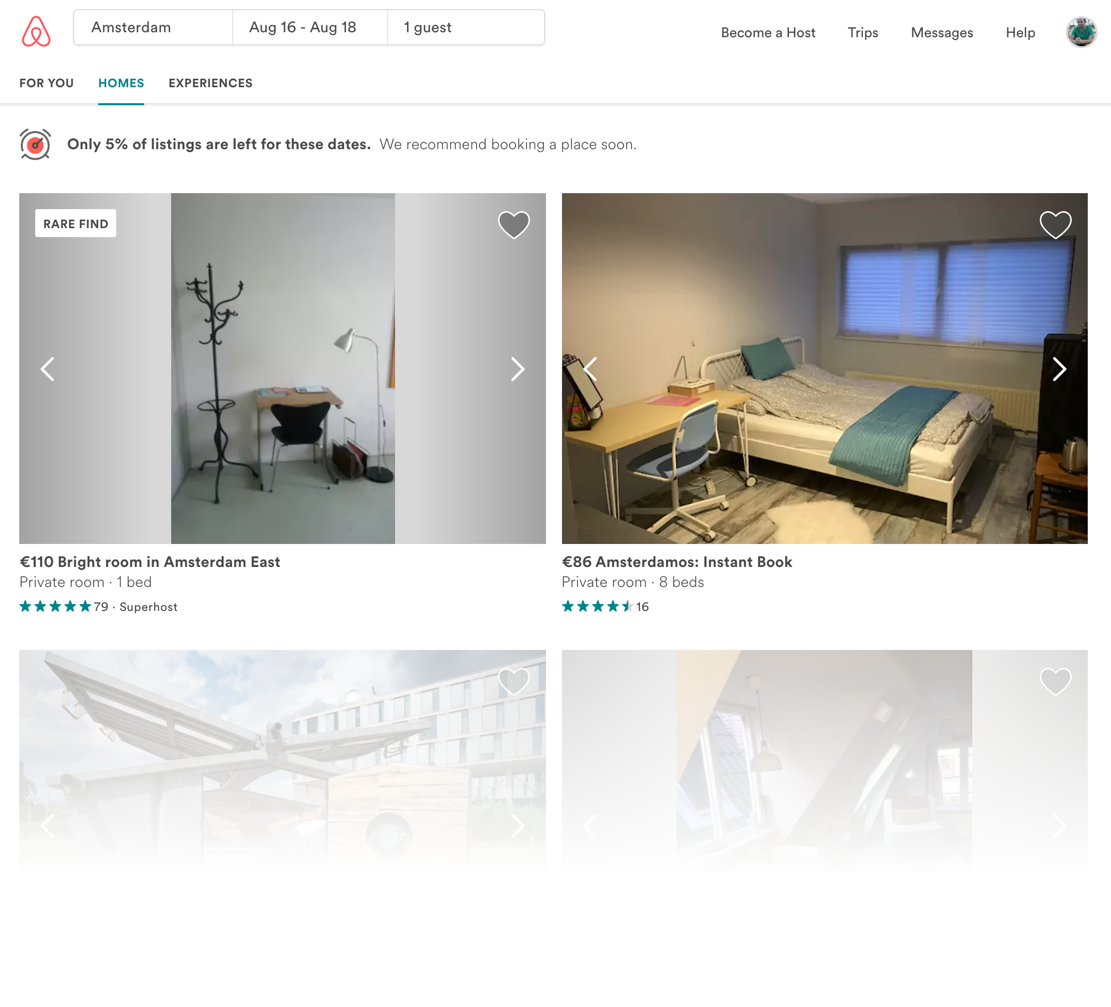
Although I quite like the overall experience using the website/app, I'm not a big fan how the results are displayed when searching for a place. Somehow, I feel the division between the list and the map view makes this part a bit overwhelming for higher resolutions. It gets better when the window size is smaller, making you switch between list and map, which occupies the whole content area - no spliting then.
But my biggest issue is about how prices are displayed. Again, showing price/value of something is an issue in a lot of places, a business decision. From the user's point of view, I just feel it needs to be as transparent as possible. I hate when checking the price for something and then, when checking the details, it increases due to fees or other stuff. And that's what happens when you search for something on Airbnb: instead of showing the full booking price for the time I've selected, the results page show the night price, with no fees.
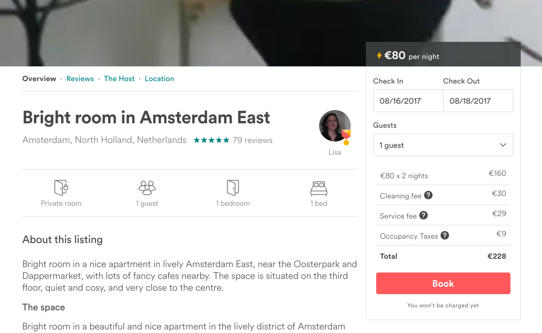
In the example below, see that I was checking for a place in Amsterdam. Airbnb informs me that the price is 110 euros for the Bright Room in Amsterdam East. But when going to the room's detail page, guess what: the total goes to 228 euros. And that's a problem.
recommendation
That's the part I like about Booking, for example. It shows me the full price for the whole staying. I mean, I've put the dates already, they know how much I will be staying. One would argue that showing the price would scare people off or that Airbnb is not about the price, but about the experience. Yes, I agree, but price still matters a lot. My frustration of knowing the full price is bigger than my desire to be in an amazing place: I would simply not be able to afford it.
Simply put, I do believe Airbnb should display the full price during the search process. The visual solution would be simple, although I tried different ones changing the position between price and rating lines. Below you can see how it turned out.

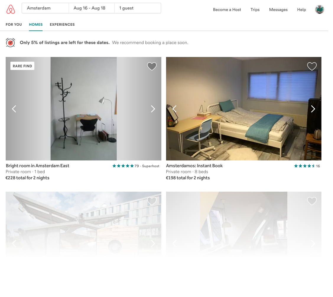
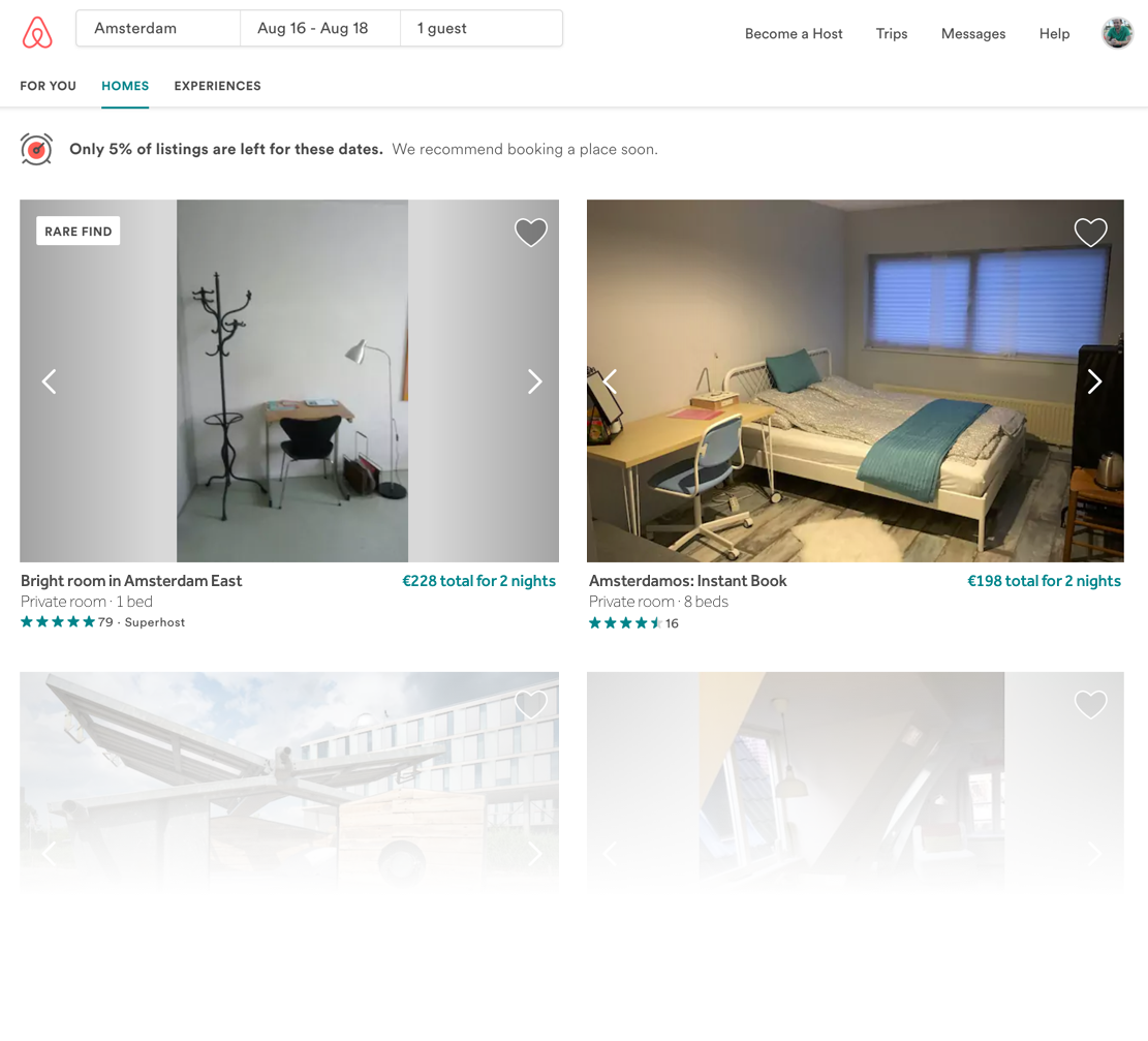
And the final one, having a clearer view on all the most important information about my booking. For this final recommendation, I also increased in some pixels the space between one result and the other:
Thank you for reading. You are very welcome to share with me any thoughts you have. That's it for today.
| end of day 12 | ||
| previous | back to all | next |