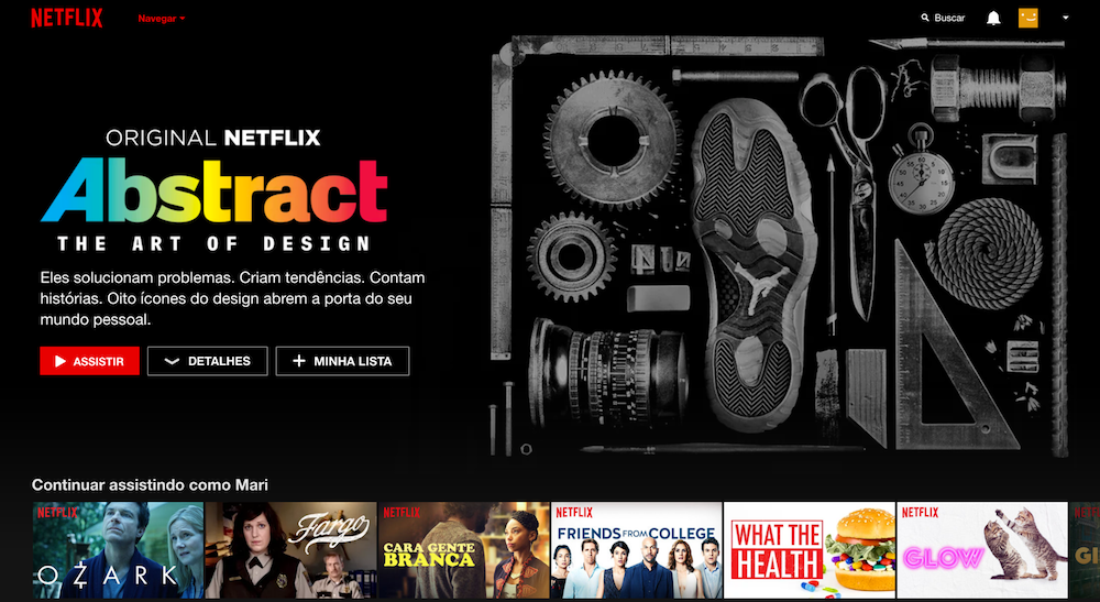
how it is today
There is always great content showing up on Netflix. As I moved to a different country, I get the chance to experience some local production as well now. Not everything is perfect, though. Season 5 of House of Cards, for example, is not yet available in Germany due to licensing contracts - here it's broadcasted by Sky, if I'm not mistaken. Anyway, back to user experience design.
There is something I find annoying when discovering new content, specially when it's on the main area of the home page. Sometimes it's a documentary, sometimes a movie. Or that new show being released. And although most of them you might have heard of before, others are kind of unknown, so I'd use some more details. Thing is, when in the main area, there are only two buttons: "Watch" ("Assista") and "Add to watchlist" ("+ Minha Lista"), like the example below - forgive me, my Netflix is in portuguese, as I share my subscription with a friend in Brazil, but you will clearly understand what I'm talking about. hopefully.

It's not like something new to Netflix. When browsing through the smaller boxes below the main area or when searching, you get the chance to know more about that production by positioning the mouse over the image. An arrow is shown, so you can click to expand the content area to read more information about that specific movie or show.
recommendation
You know where I'm going with this. One. More. Button. But I do believe it could be useful and actually make me watch more of the content Netflix decides to put in the area for me.
The recommendation would be, then, to add a button called "Details" ("Detalhes") right next to Watch ("Assista") and "Add to watchlist" ("+ Minha Lista"), same format as the other two and using the same icon (arrow) used in the smaller content boxes.

Thank you for reading. You are very welcome to share with me any thoughts you have. That's it for today.
| end of day 13 | ||
| previous | back to all | next |