how it is today
A friend of mine is coming to Berlin and he asked me where to stay. He was checking places on Airbnb and sent me some links. He was also interested in knowing about unique spots in the city, tourist areas, restaurants and so on. And he wants to stay close to my place, so it's easier for us to meet.
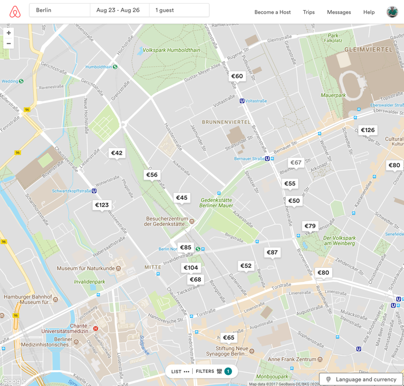
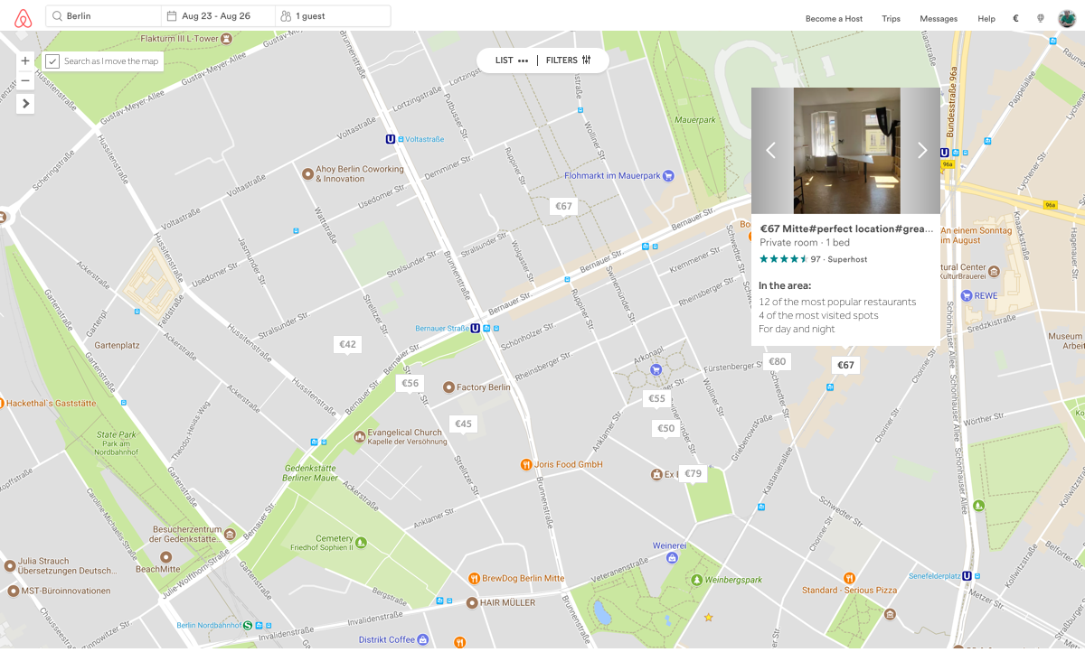
I use the highest resolution my laptop supports, which is 1920X1200, maybe you do too. But a lot people don't, right? This way, for a lot of websites, I visualise things differently due to responsiveness. When checking Airbnb, I get to see the list of places and the map at once. Like in image below:
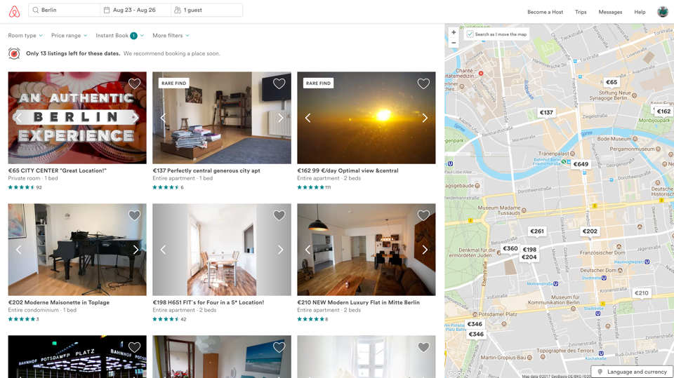
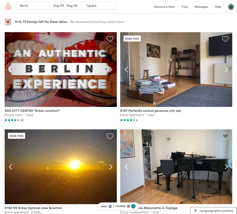
If I resize the browser window to around 1000px, the map is not visible anymore and a control area is added to change between list and map views, as well as the filter settings.
The issues here for me are: 1) it's not because I use a high resolution that I should be prevented to see the whole map, specially when I actually prefer to see it, so I get to view the whole area and what is in it; 2) when resizing, the control area stays on the bottom of the page and it clearly gets mixed up with other content.
recommendation
This was a very straight-forward one. Add a button so the user can always control how they want to view the content: list or map. The button (arrow) goes right below the zoom in/out control of the map, indicating that the map would expand or, when full screen, go back to its original position. The control area goes to the top (yes, I chose to keep two buttons doing the same thing when expanding the map). It would look like this:
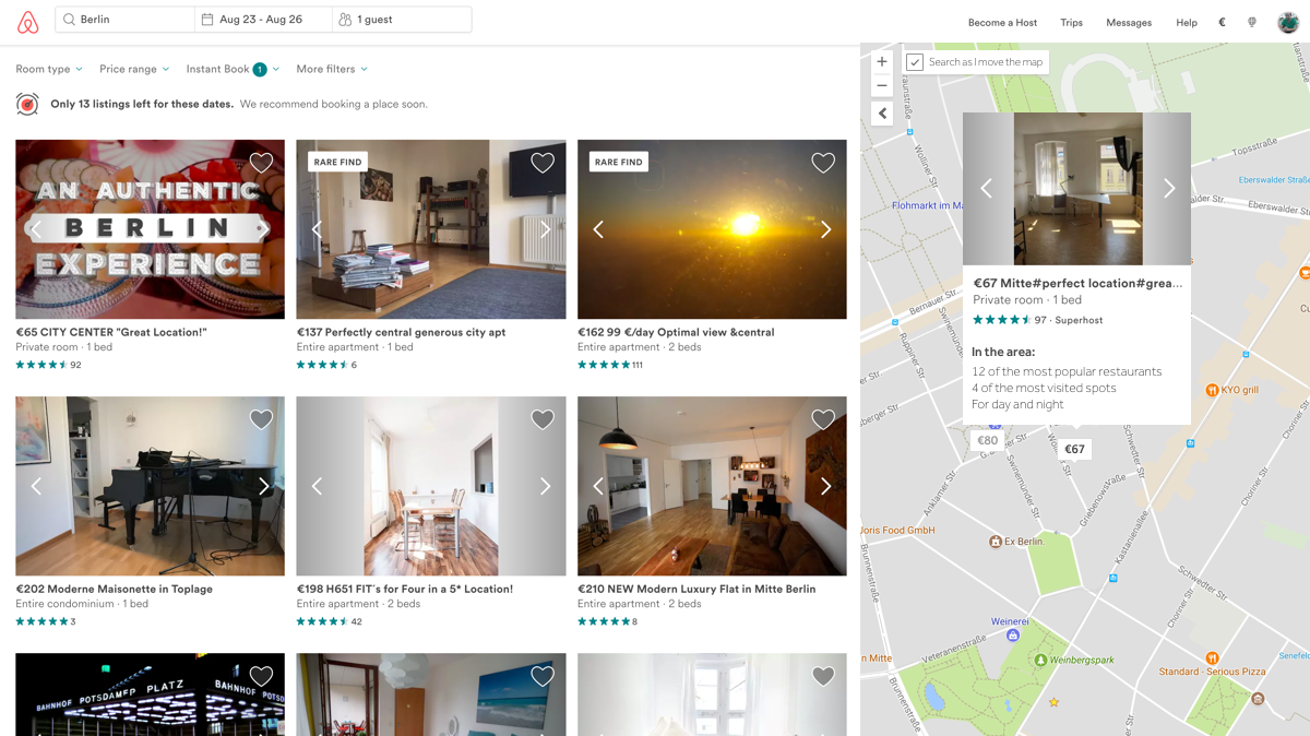
I've also added and changed:
- Useful information in the selected place:I believe Airbnb could explore some more information about the surroundings of the place people are choosing to stay. For example, I added touristic and gastronomy data, as well as a sort of behaviour the area has - if it's a club area and there is not much around during the day, it would simply show "Nightclub area".
- Currency and Language: a while ago, this button was positioned on the bottom left corner, but I guess Airbnb realised that the status bar from Chrome would prevent people to see and use it properly - the status bar would be on top of it when rolling the mouse over the link. So they changed it to to bottom right corner. Still, it just seems to be out of place, hidden. My suggestion would be to have two separate links on the top menu using icons for currency and language. Not much space required, no harm, I believe.
Thank you for reading. You are very welcome to share with me any thoughts you have. That's it for today.
| end of day 19 | ||
| previous | back to all | next |