how it is today
I believe Jovoto is a valid idea. But that's me. And much of it is related to the way I understand what the platform is for and the way I use it sometimes. I won't write all of my reasons here, but let me say that I think Jovoto is meant to give an initial concept for the client to work on. I don't think it's meant for professionals to deliver the final product, although some of them go way further into it. Having this in mind, when I choose to work in a contest on Jovoto, I set myself the time I'm willing to spend doing it. The last one I joined, I spend around 8 hours of work, maybe less, and it gave the chance to be rewarded with the biggest rate by the community - there is a cash prize involved.
But let's talk UX. Some of my friends have shared that they don't participate because the website is not so friendly or inspiring. I do agree with parts of this kind of feedback. One of the areas I feel that needs to be changed is how is you manage the files you upload - how you visualise the ideas is also an issue for me, but I will focus on the managing part for now.
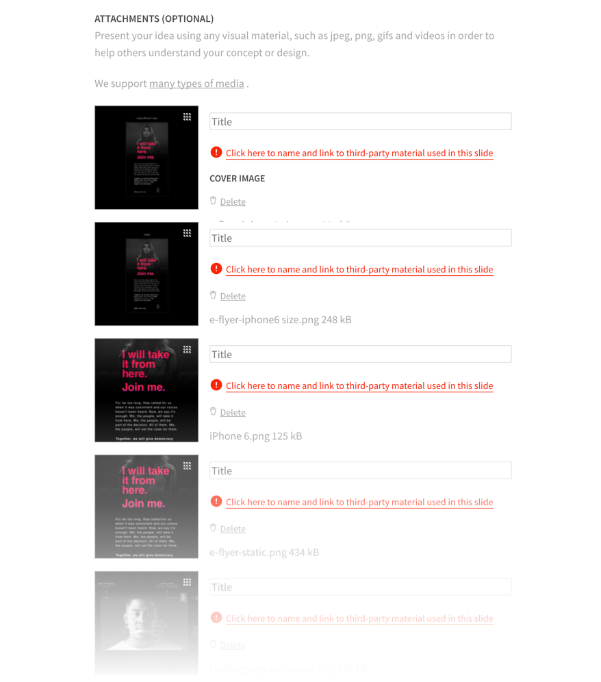
When submitting an idea, first you have to answer a few questions to introduce your view and your idea. Then you upload the files. For this part, you can only view your files on list mode, vertically. When you have just a few files, it's ok. But when you have more, it's not an easy task. You can always choose to upload a PDF, but Jovoto limits the number of available slides when in preview mode, so your presentation might be cut at some point, being mandatory for the viewer to download the file to read in its full. This is how the area of managing files looks like:
recommendation
My suggestion would be for Jovoto to add the grid view, leaving to the user the decision of how they want to visualise the files. The main benefits of the grid view, in my opinion, is to make it easier to move files around, changing their order, and also to have a greater view of the whole concept - the same area would fit more than 3 times the number of visible files. It would look like this:
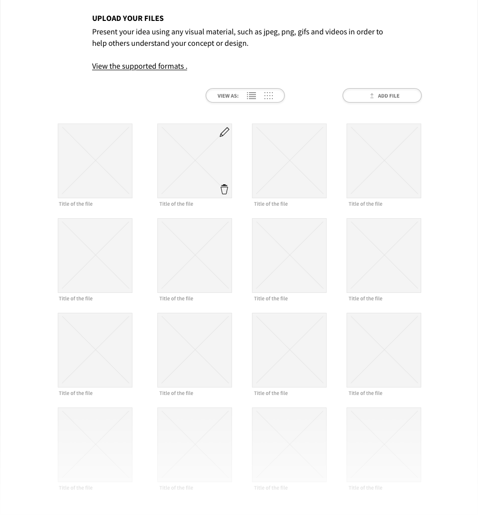
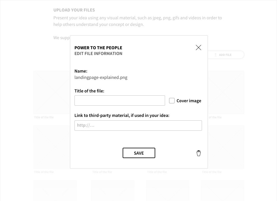
Jovoto could also implement a slider to change the size of each thumbnail, but let's focus on the basics. Each thumbnail would have a icon to edit the file's information and another one to delete it from the grid. The view controller would be always visible (when scrolling), and the same would be applied to the Upload button.
To edit a file, by clicking on the pencil icon, a layer would appear so the user can add/edit the information, such as how they want this name to be called on the website, if it should be the cover image of the idea and link to a third-party material, just like it's today.
Thank you for reading. You are very welcome to share with me any thoughts you have. That's it for today.
| end of day 18 | ||
| previous | back to all | next |