how it is today
This one is hard. Any new feature might change and decrease speed when searching, I get it. And I know Google has their reason not to do it. But let's go.
Let's say first that I rarely use the Google search field, even when I'm searching on the website. I always try to learn some basic shortcuts and CMD+L is one of the most used ones here - using the browser's URL field to search directly. But I've seen other people using and a lot of them have the very opposite behaviour: the search field is there for a reason, so they use it. A lot. Let's imagine a search for landscapes images.
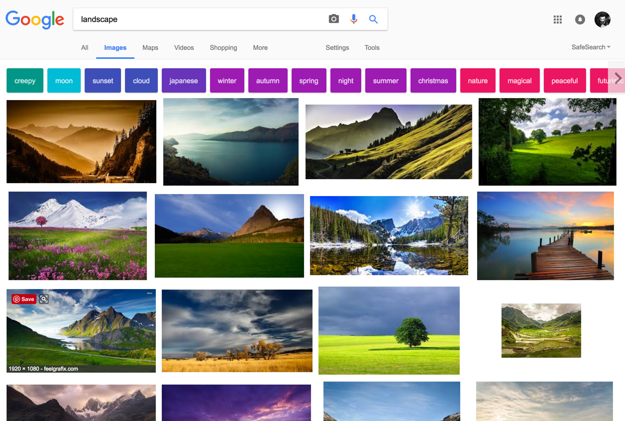
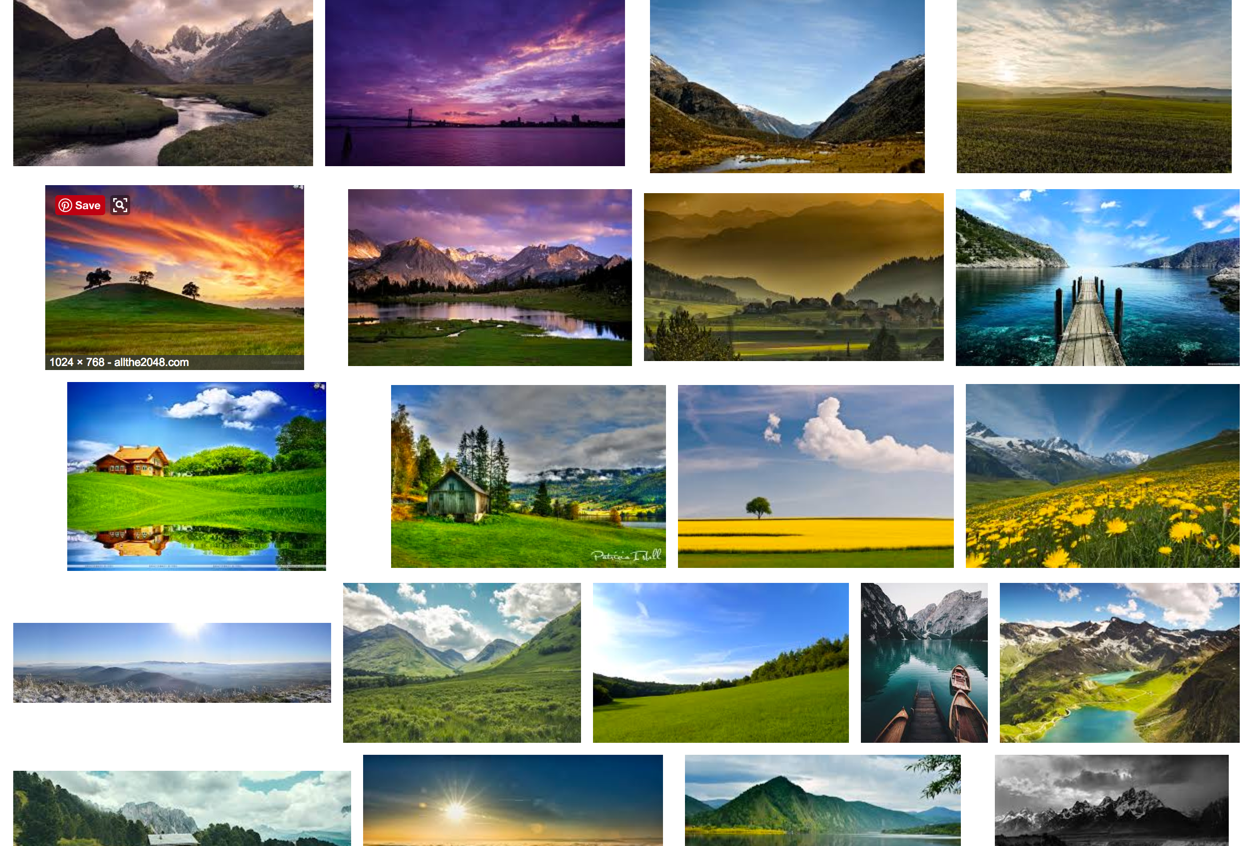
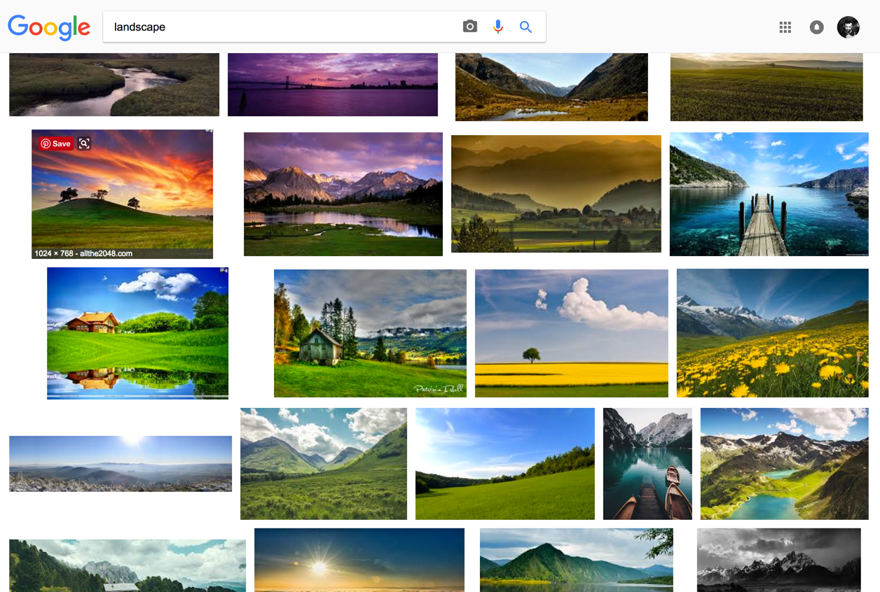
Then you scroll down. And scroll down. Then you click on one image. Close. Keep scrolling. Scroll up and down. And then you want to change or refine your search. Where is the field? The image below is the result of the scrolling:
recommendation
Different services, even from Google, like Youtube or Gmail, simply has the "header" area always visible. It makes sense, because you're jumping and searching for new content (not much on Gmail, ok). For Google, the search is the main purpose of it, so I believe it's worth having its access as easy as possible. The simple recommendation would be like this, having the header always visible when scrolling the page:
Thank you for reading. You are very welcome to share with me any thoughts you have. That's it for today.
| end of day 7 | ||
| previous | back to all | next |