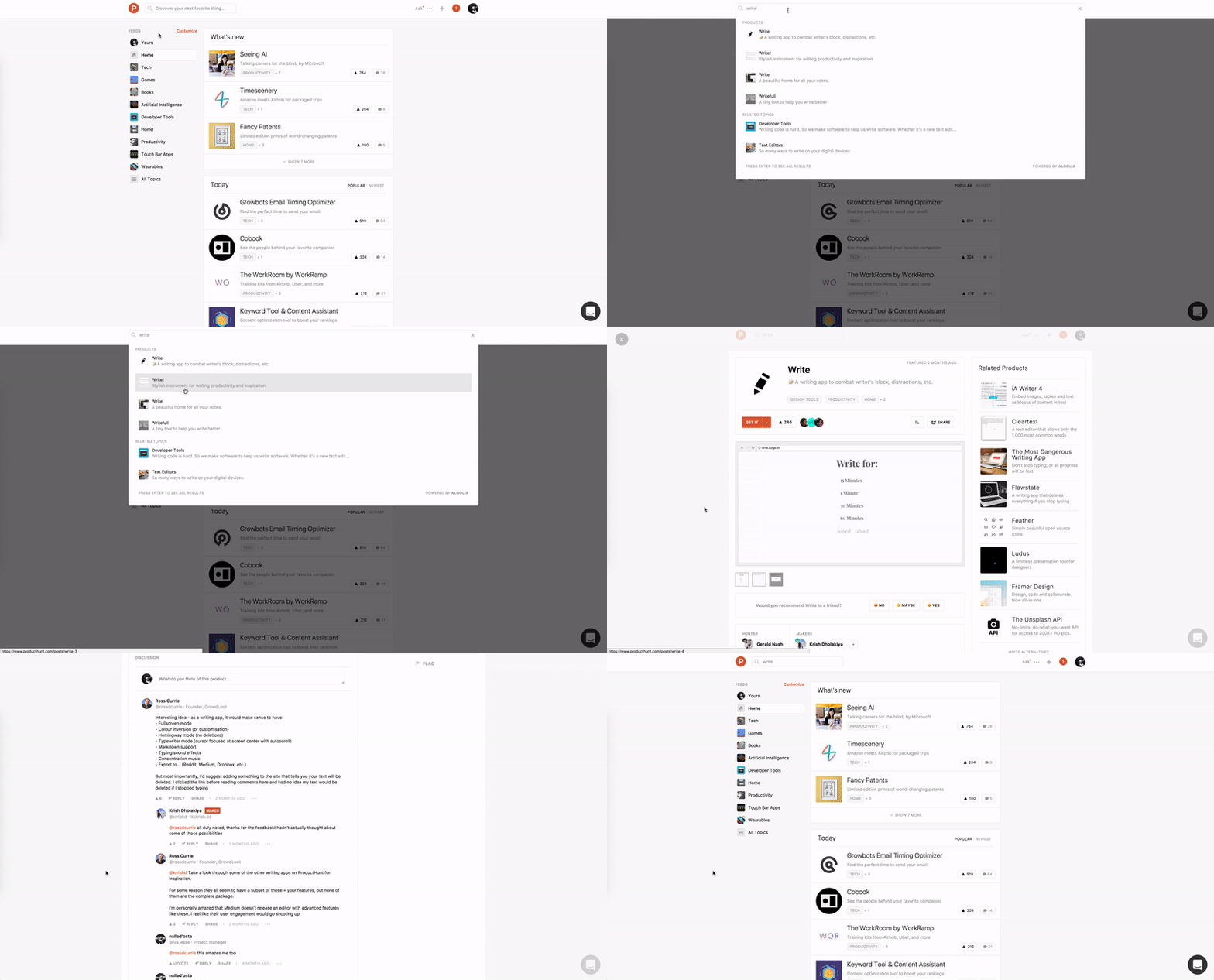
how it is today
When searching for a product/service on Product Hunt, the results are shown as you type, right? If you click on one of them, the chosen product's description is show in the main content area (center of the page), but within a layer over the rest of the page. opacity is applied in the surrounding area so you can focus on the content you searched for. But if you click outside this area, the content disappears. The other day I was getting comfortable on the couch and when I touched the trackpad, I couldn't find the content I was reading.
Perhaps, it's not likely that you're going to click out of the blue on the surrounding area, but it might happen. It did with me, and I wasn't even doing this project yet. There is a "close" button on the top left of the page, but when you scroll the page, it disappears.

recommendation
Simple solution, probably with some javascript lines, would prevent the click being possible outside the content.
The ideal one, IMO, would be to show the result as any other piece of content on the website, in the middle area, no layer involved. I'm not seeing the point of having it as a layer here - I would, maybe, if some horizontal navigation was added to navigate through the best results. But that would, probably, complicate the navigation system a bit.
Thank you for reading. You are very welcome to share with me any thoughts you have. That's it for today.
| end of day 8 | ||
| previous | back to all | next |