how it is today
But there is something about how the user view and organise the content, follow the activity, specially when the drive is shared with different people, and upload files and folders that made me think of a suggestion. This is how the page looks like today:
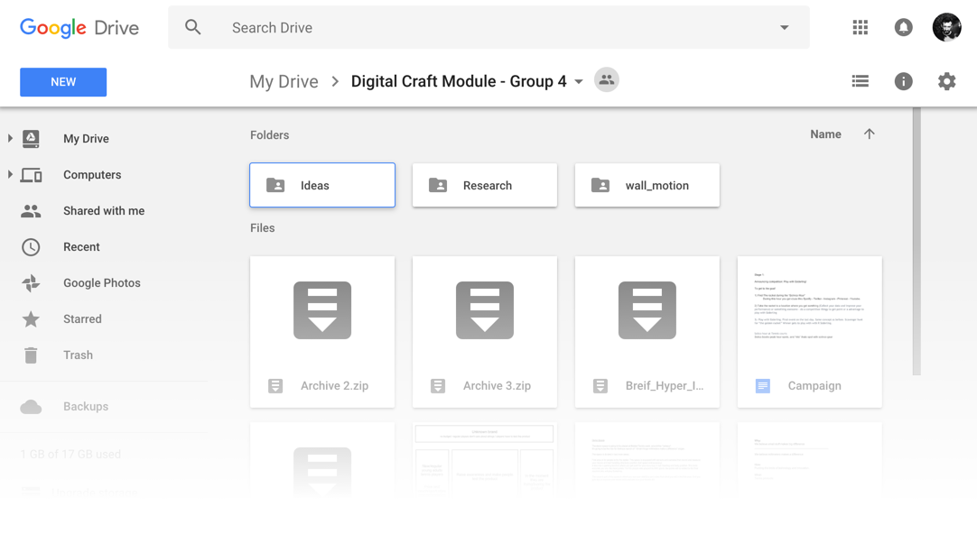
Working the other day, I wanted to upload 2 or 3 files into a project. I didn't drag the files, so I was looking for the upload button. I kept looking in the middle area, where folders and files are displayed, but couldn't find it. Looked to the right area of the page, but nothing. Then I realised I was using Drive and this button is called "New", found on the top left side of the page.
recommendation I
When navigating through files and folders of a project, it seems to me that the user's attention is centered in that content area of the page. Move, create, change view, upload, delete etc. So, in my opinion, everything connected to managing those files should be there, including a shortcut to upload new ones and also new folders. So I thought of adding a shortcut for this action, including an upload button in the grey area where the files are concentrated. The reason why is that 'New', in my opinion, is more associated with creating something, not necessarily uploading.
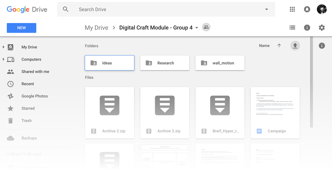
But then there was a problem: the 'sort direction' icon is too similar with the upload one because of the arrow - I tried to follow the same pattern as the one to upload files on Youtube. Plus, when looking more carefully to the page, I had the feeling that some other icons were sort of lost in there. For example, the button which expands/hides the activity area and the list/grid view ones.
It happens that with the list/grid view button, instead of having a direct connection to the area where the files are, they are one step higher in the hierarchy. I understand it's aligned with the name of the Drive, so the thought might be that you change the whole Project view, which is true. But I also think that these buttons (list/grid) are too far out from the files, specially when the activity panel is displayed. In addition, shouldn't be the same with 'name' and 'sort by' buttons, as both changes the way the user organise and view the files? These two, in my opinion, are in the correct position, and I feel the list/grid view buttons belong in the same level.
recommendation II
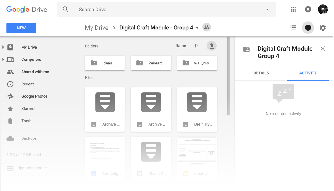
I decided to relocate all the buttons.
- The ones closer related to different types of visualisation of the files (grid and list views and sort by options) are centered in the files and folders area.
- The upload button gets a new label called "Add", opening up a layer to upload files and folders, and it's used as a shortcut. In order to create something new, the user would go for the existent "New" button.
- The button to expand/hide the activity panel is repositioned to the area where the panel is located. When the panel opens, the icon is simply replaced by the close button.

Thank you for reading. You are very welcome to share with me any thoughts you have. That's it for today.
| end of day 4 | ||
| previous | back to all | next |