how it is today
Quite easy one. Got an email from Spotify the other day about a new release. Although I don't speak German (yet), I knew it was something from Lykke Li and that I should click on the green button to find out. The result is shown on the next two screens.
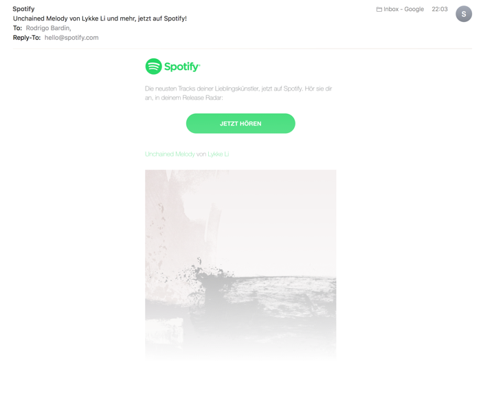
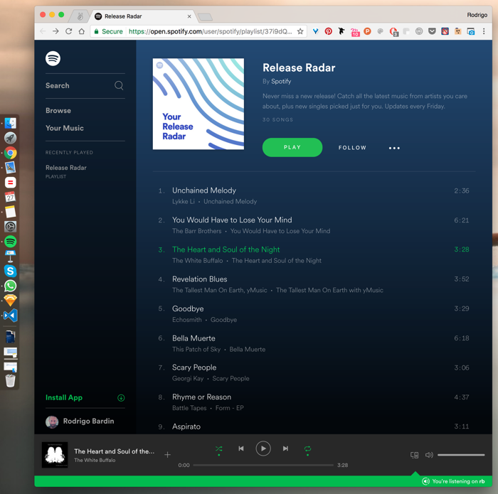
If I have mixed feelings about the apps, it's clear to me that I don't enjoy the web player. It always felt weird to me, slow, different in a bad way. But there I was, accessing the 'Release Radar' playlist via Spotify's web player after clicking the email button.
Right away, I tried to find a way out of it and started looking for an "Listen on Spotify app" or something. Nothing. I could only find the "Install the app" button, which would lead me to this page: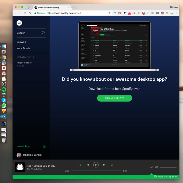
recommendation
I'm sure you know it already. If you look again in the image above, you will see that I already have the Spotify app installed.
So no screen needed here, just a thought or two on User Journey. A simple "Listen on Spotify app" button or even a system message window after clicking the button (so I could choose where to listen, web or app) would do the job. And it's not that it's something unknown, because the green area indicates that I'm listening to the music on the app, even when I use the controls on the web player, which makes the experience even more strange.
Spotify team, please.
Thank you for reading. You are very welcome to share with me any thoughts you have. That's it for today.
| end of day 3 | ||
| previous | back to all | next |