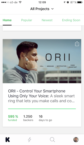
how it is today
Despite my love towards the brand, I feel that the experience is a bit overwhelming. Most of this though, I have to say, is related to the amount of content written by the creators on their projects. But there is also a few things I'd try to make it faster and more transparent when displaying the project to the people. For example, on the app's home page.
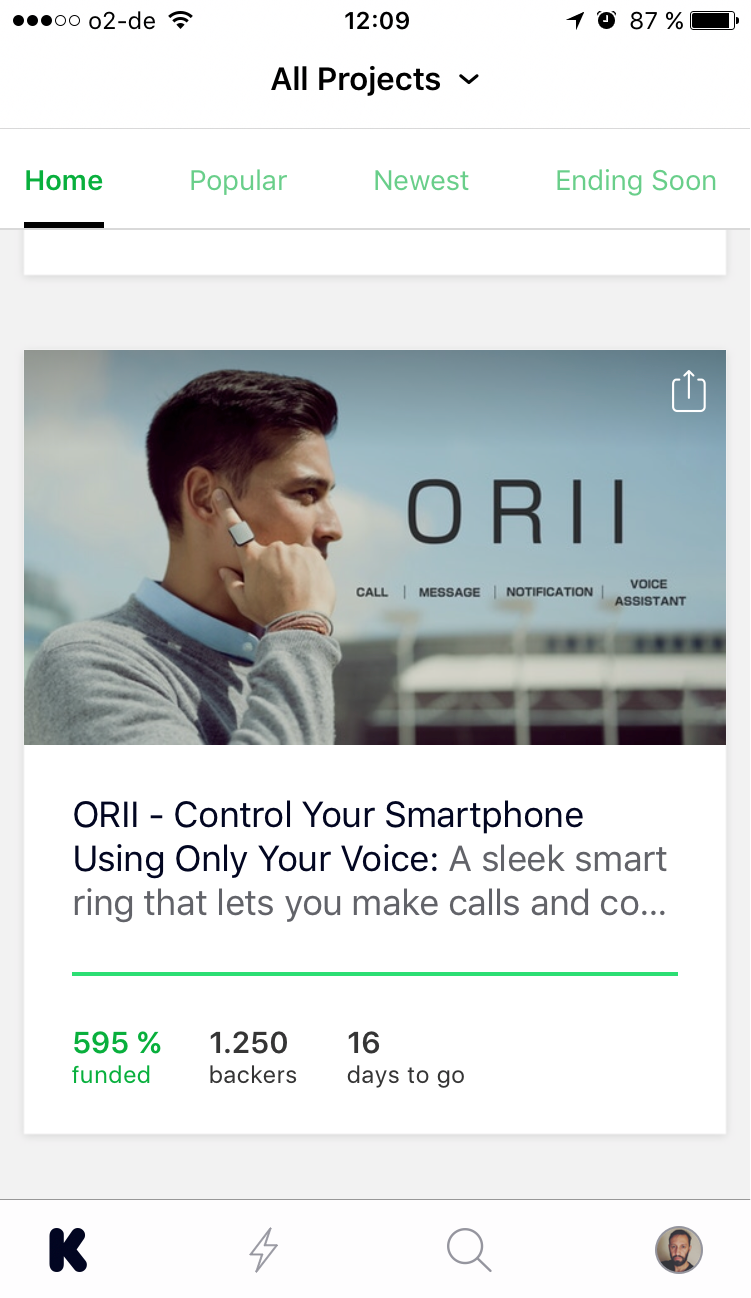
The whole area is clickable, giving the user access to the project at its full. But like I said before, I felt there were a few things missing: 1) watch the project's introduction video right away; 2) direct access to reading the details about the project; and 3) viewing the available pledges (how much to back this project?). Today, to be able to see them, you have to go to the second and third levels of the navigation.
recommendation
Straight away, I started by adding a "Play" button to the hero image and two shortcuts: details about the project and access to the pledges. The "Play" button follows the standard of the project's inside page.
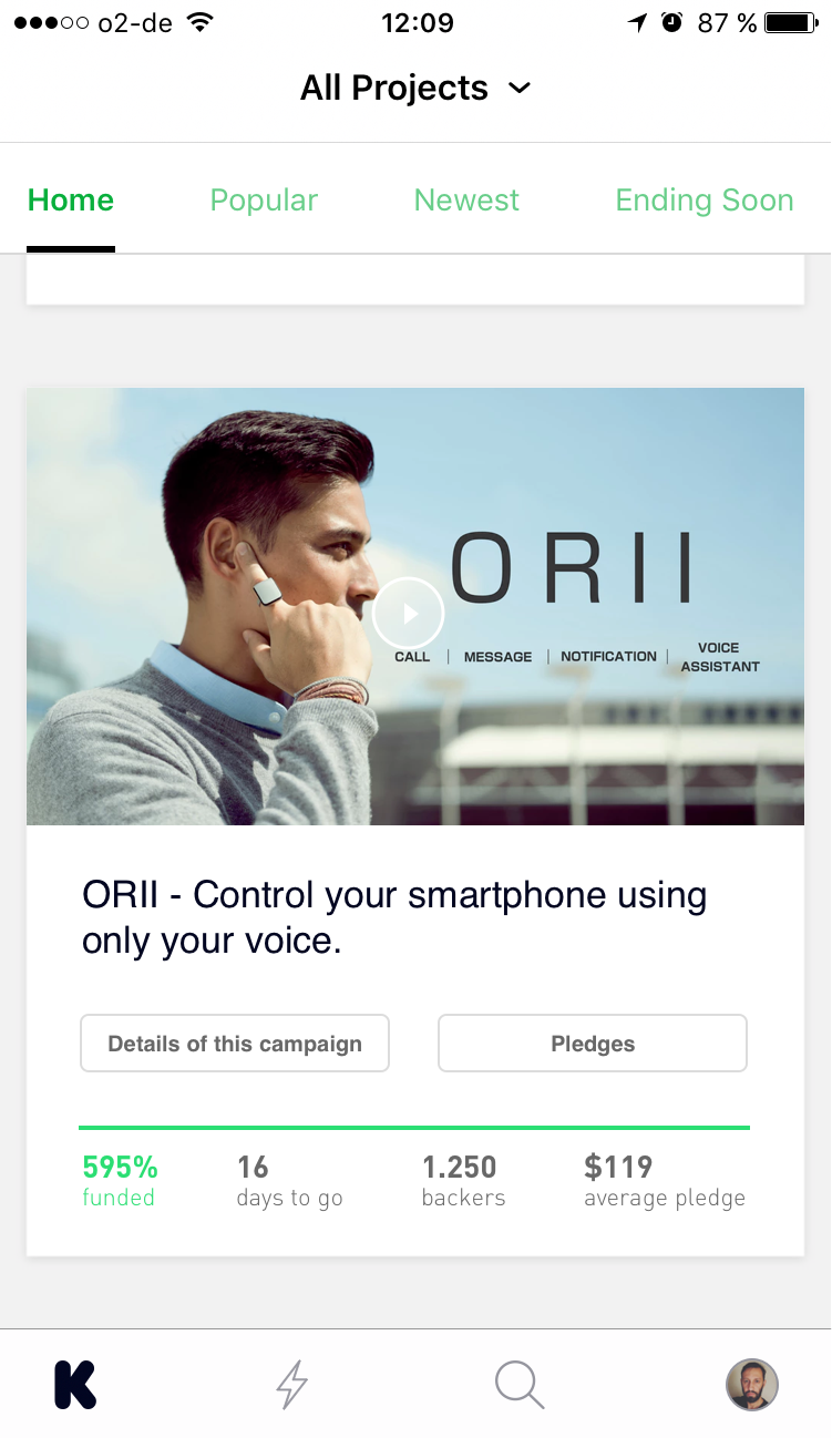
As for the "Details about this project" button, the thought behind it is quite simple: most of the Creators put a lot of effort into how they describe the project and, today, the link to access this content is not so visible in the app. The user needs to click on the project on the homepage and then on "Read more about this campaign" link on the second level. The problem I find is the format of this link: I believe it gets mixed with the other information and it's hard to be seeing.
A couple other suggestions:
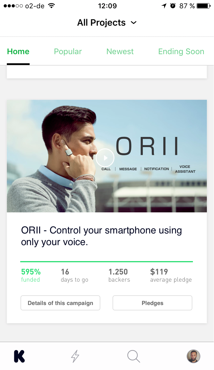
- Title: reduce the decription to the title of the project. The current version would also display the description of the project, but as there is no space to fit all the characters, it usually gets cut off.
- Average pledge: this one might be tricky. In the proposed version, the user would see what's the most chosen pledge to back the project. Today, you can only find the value of each pledge by going to the second level. Although this might be a business decision, a way of maybe not scaring people by showing the "price" (it can get really high) and presenting the content first as a way of persuasion, I also feel the experience should be more transparent when it comes to expectations. For some, to not know how much is the pledge can be frustrating, specially when they like the product and then see that it's not affordable - or even overpriced, which can also happen. Having the other support information together, like number of pledges and percentage of funding, would help to take a bit off of the weight when talking price and reinforce how the community is receiving this project. Curious users and others who don't mind about the price would always go in, hopefully.
But I wasn't happy with these suggestions. The position of the shortcuts on the homepage was breaking the flow of information. First, get introduced to the project; then, see how the campaign is performing; go to details. So I've relocated the buttons to the bottom of the project's area:
Lastly, as this is the first time the potential backer gets in contact with the product, I felt the "Play" button seemed to be getting in the way of the hero image. So instead of having the button over the image or creating a control bar for the video, I chose to go on this direction, which brings two elements together: the movie and the title of the project.

These are the two versions side by side - the current version and the proposed one.

Thank you for reading. You are very welcome to share with me any thoughts you have. That's it for today.
| end of day 5 | ||
| previous | back to all | next |