how it is today
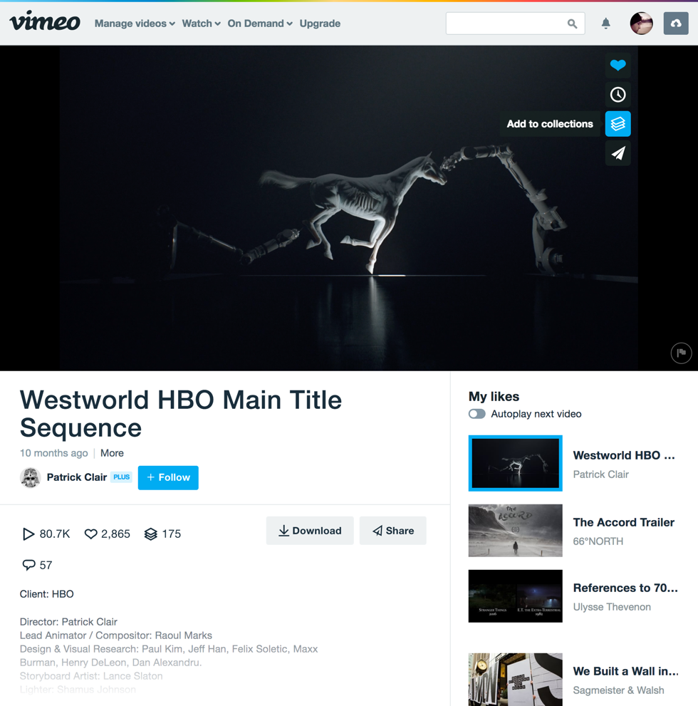
I've used Vimeo for a lot of reasons: personal entertainment, professionaly when trying to communicate an idea, making a presentation more enjoyable to watch/listen to (having a video in the background of a Keynote changes everything) or looking for references for a project. I'm doing it right now for a side project I have.
To make it easier to group the videos I find, there is the "Collections" feature. You can find the icon/button on the right side f each video, pretty simple.
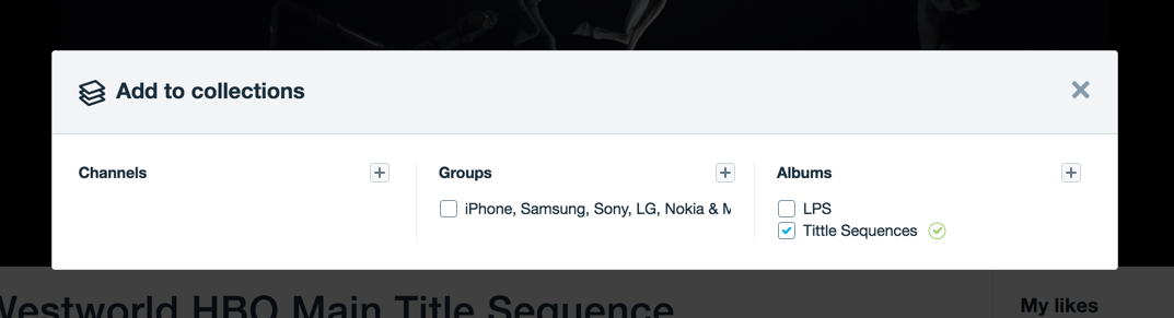
When clicking the "Collections" button, a layer comes over the content so the user can choose where he wants to save it. The problem here for me is that there is no visual information after adding the video to a collection (or a group or a channel), telling me that it's done. It simply stays like this:

recommendation
I believe that a micro-interaction could be applied here. For example, when you change something in your LinkedIn profile, a small message indicates the change you did, so the user knows he can move forward to the next task. There is a lot different examples for this and I feel the Collection feature on Vimeo is missing this part.
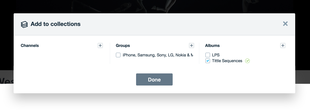
The first approach I had was to simply add the "check" icon. Important to say that the icon would disappear in a few seconds after it complete its animation. I also changed the size of some elements, like the buttons to add the content to a new channel/group/collection - in my opinion, their sizes were not balanced with the other elements. There was also an alignment issue here, but let's move forward. Same reason applies to the checkboxes, which I also changed.
Although I believe this micro-interactions and the close button would make it easier to understand when the task is done / let me close this layer to move forward, I don't think it would be too much to have a "Done" button. In a lot of tasks, "done" means you did what you wanted to do in the area, which has a different meaning than just hitting the closing button. So the final suggestion would look like this:
Thank you for reading. You are very welcome to share with me any thoughts you have. That's it for today.
| end of day 17 | ||
| previous | back to all | next |