how it is today
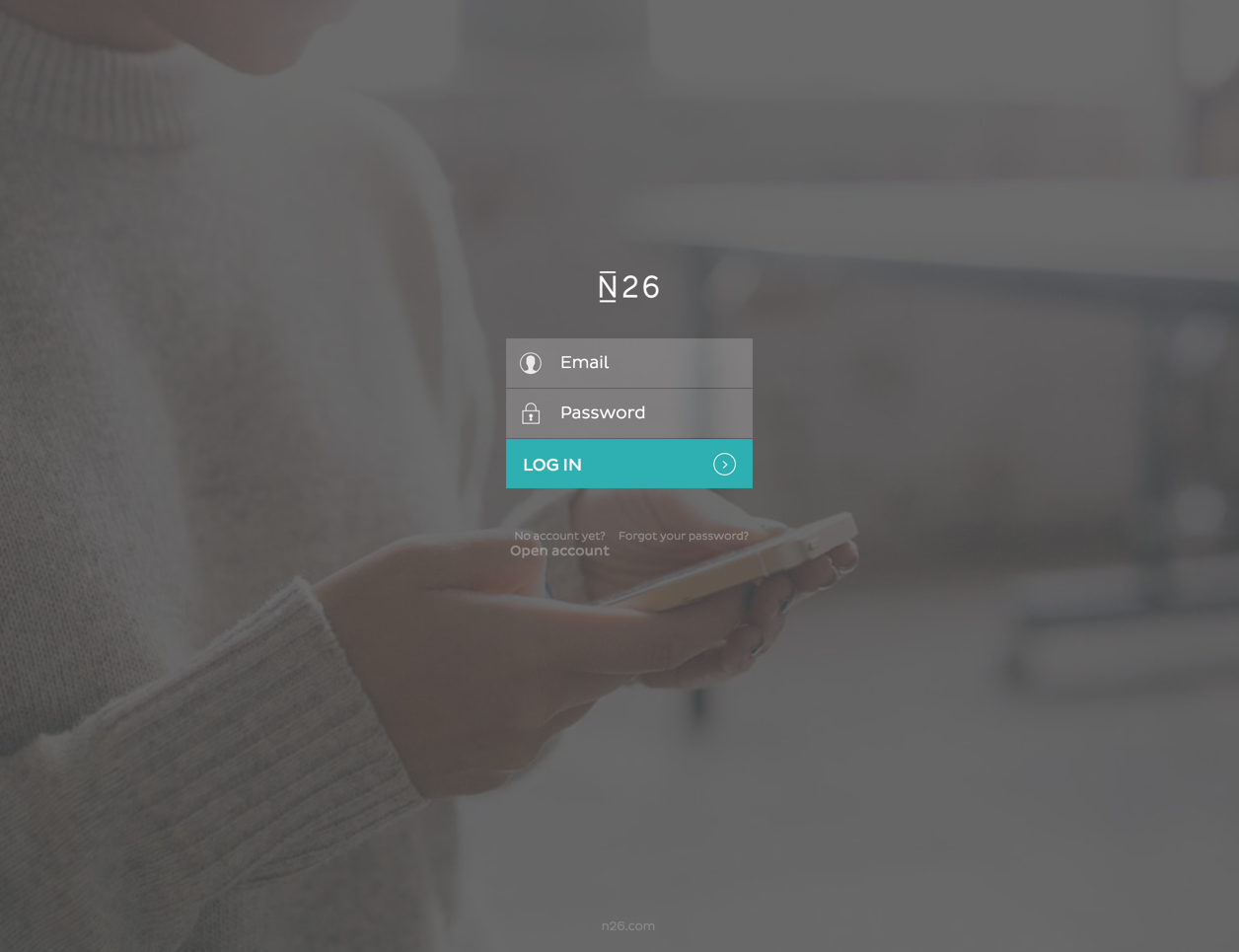
Although N26's experience is more focused on mobile devices ("The Mobile Bank"), there is also a few things you can do on the desktop version. For a lot of reasons, I still access the latter on a regular basis. Although I thought of simply proposing that the email field is active/focused right after loading the page - now I have to do it myself before typing my information -, I also thought the login page could have a different structure. The image below show how it is today.
recommendation
Thinking about the current version, first I thought about not having this fields as a layer for the whole website, but maybe there is a technical issue. Back in the day, when I worked as a UX Designer for a bank, the developing team would say that because of the security certification (it also and directly influenced the page's speed), we would have to have the login area separated.
Keeping the log in page separated, let's get to work. First, the background image doesn't communicate much. It illustrates someone using the phone - but hey, I'm on the desktop version - and it's visually appealing. So I decided to take the image out and simply have the fields. Also, the current ones are visually way different than the whole website's aesthetics.
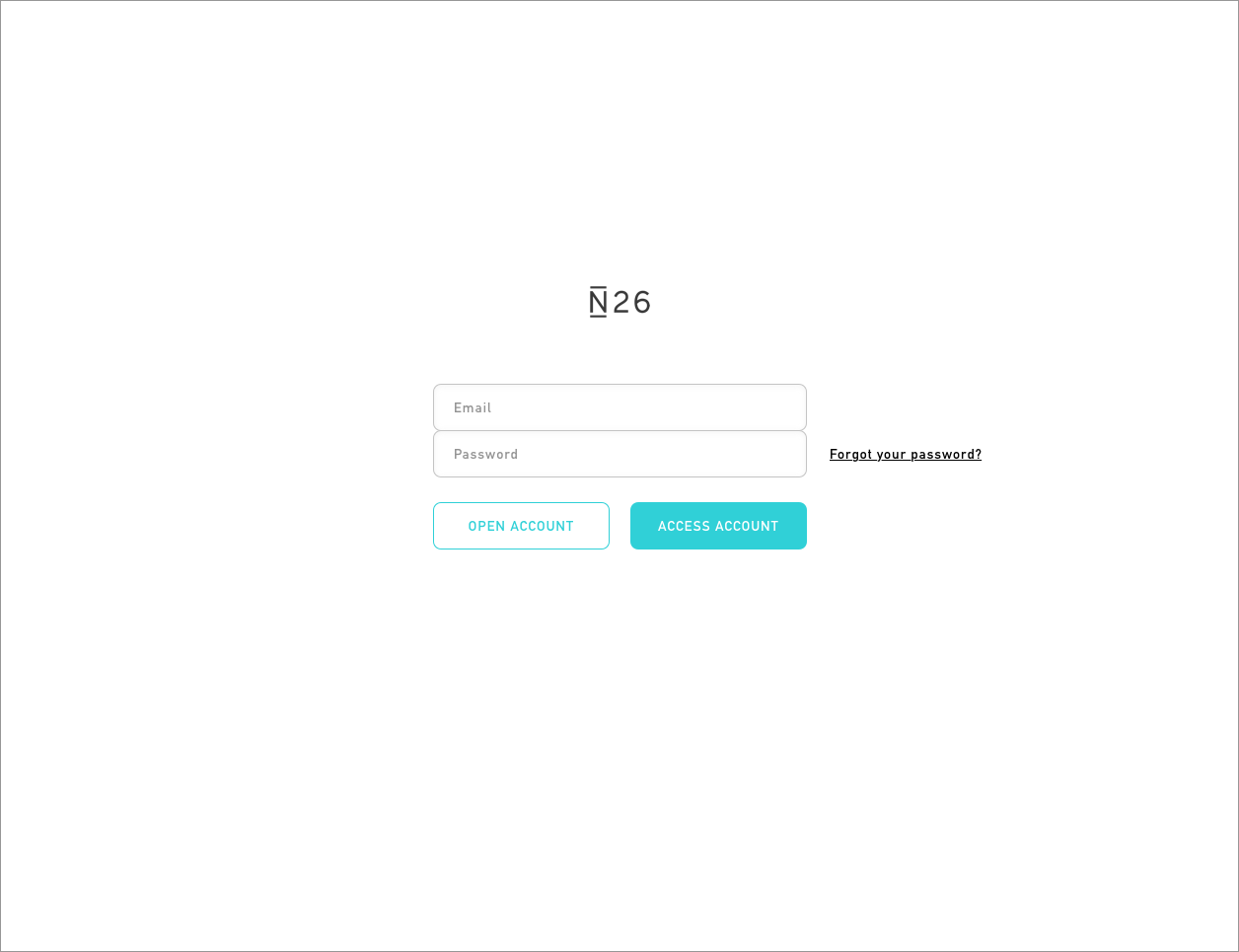
Of course I wasn't happy with this version. The structure didn't seem to be communicating a login area; the fields were still weird. The biggest addition here was the "Open account" button. My first thoughs were that this action deserved a bit more attention - thinking of it almost as a email login page. So I ended up with this new version:
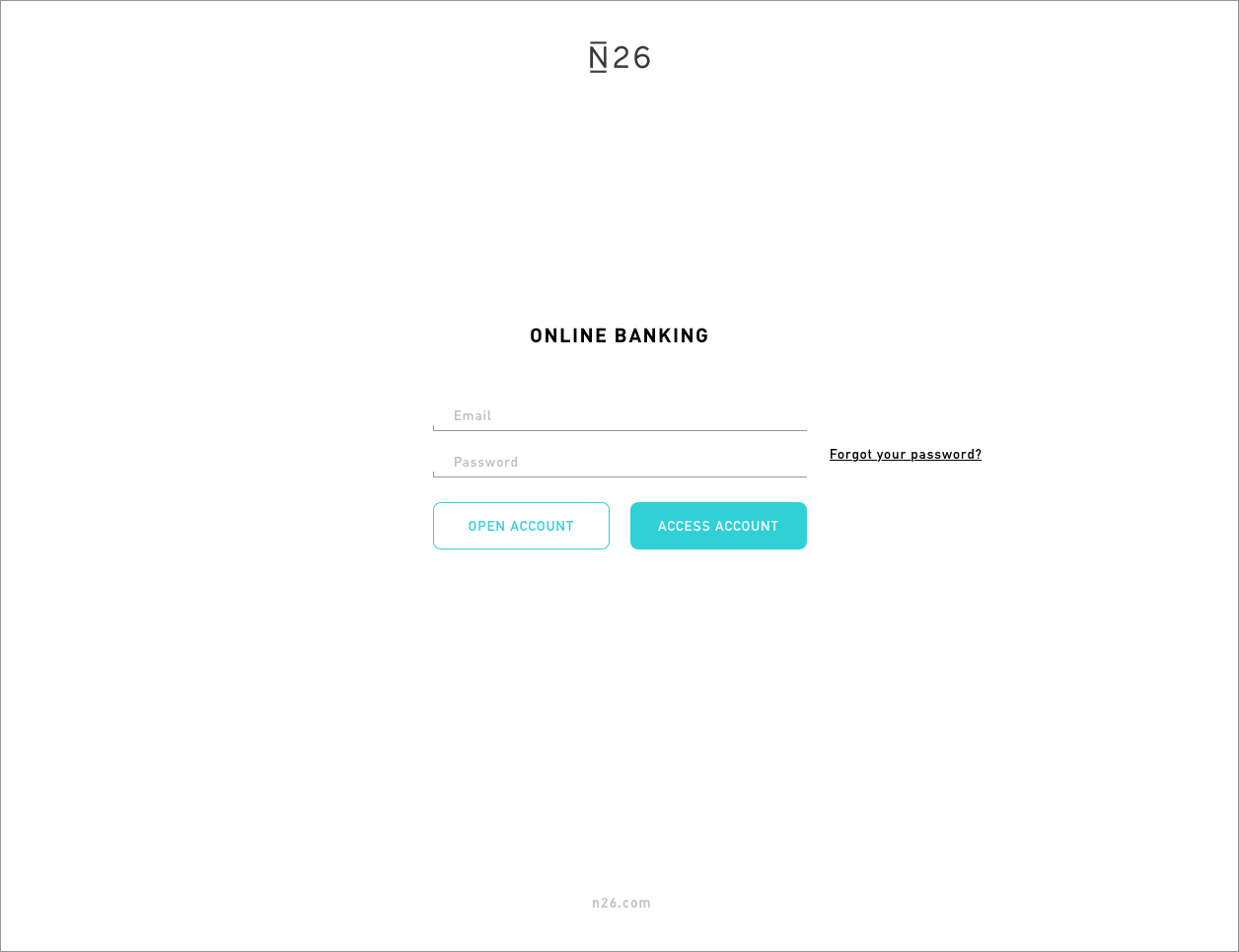
No, that was not it. I started having second thoughts about the "Open account" button". This is a page you will login to your bank account and it seems that a "selling" button shouldn't be that big. Also, the "Forgot my password" link seemed to be distracting from the password field. Working on some different elements as well, this would be a final recommendation:
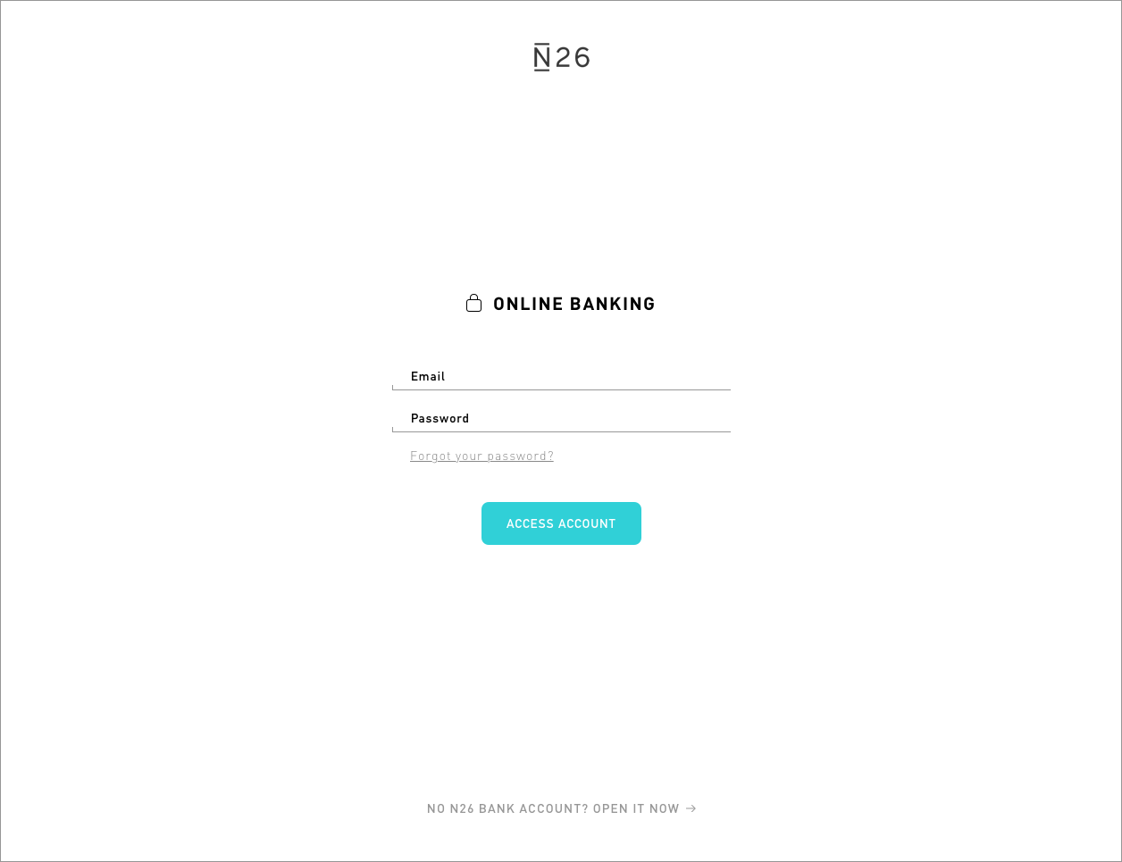
Oh, and yes, the original recommendation remains: N26, please made the email field active right after the page is loaded.
Thank you for reading. You are very welcome to share with me any thoughts you have. That's it for today.
| end of day 10 | ||
| previous | back to all | next |