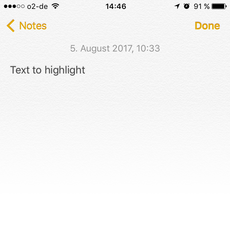
how it is today
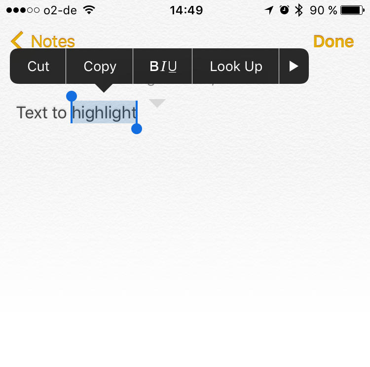
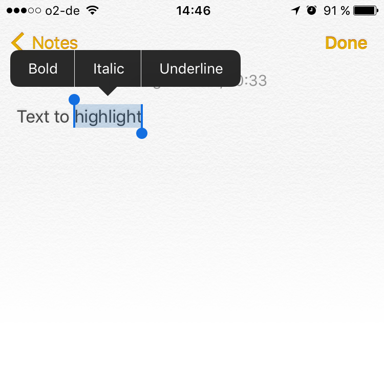
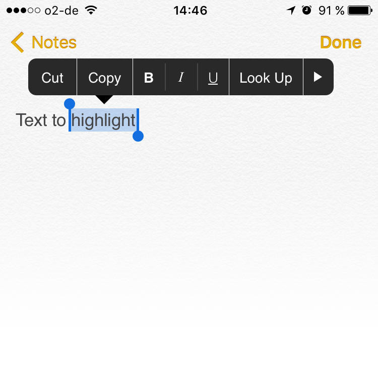
As I've been writing quite a lot lately about different things, this is probably the time I mostly feel the need of faster access to some (basic) features. For example, when I have to highlight a part of the text. Today, the user needs to double tap to select the content area and then tap again on the "B|I|U" area to choose between the three of them, just like the images below.
recommendation
At first, I thought of the size pattern each button has, but I don't think there is one - each button has its own size. The recommendation below would be for the user to have direct access to the format buttons. The space between the options is the same as the size of a letter in the keyboard, so I don't think there would be a problem to tap. The other buttons can still have different sizes, no problem.
Thank you for reading. You are very welcome to share with me any thoughts you have. That's it for today.
| end of day 9 | ||
| previous | back to all | next |